When making websites, often there are many people contributing to the design and the development. As time goes on, there will be a need to create new pages or features, and it's important that all of the people who contribute to this work are on the same page (pun intended?) about what the design should look and what specifications to use for things like fonts, sizes, colors, and components. Often when a website looks messy or poorly designed it is because its creators have not stuck to a style guide and as a result the design is inconsistent.
The style guide serves as a reference point for the web team to use when creating new assets for the website. Rather than have to guess or remember what colors and fonts are to be used they can just follow the style guide, keeping the design consistent as a result.
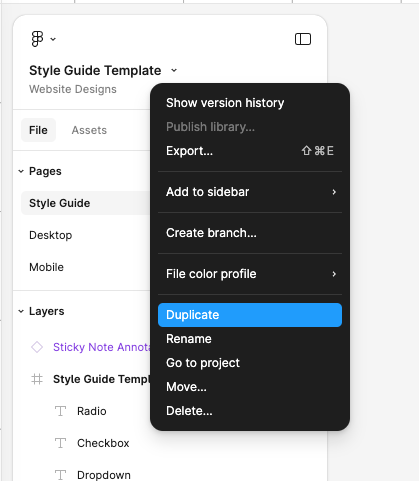
Style guides come in many shapes and forms. They can be as extensive as necessary for the team to cover all styles and variations used. Some go into detail about how to use the logo properly or what voice and tone to use in copy. For the purposes of our class I have provided you with a basic style guide template in Figma. To make your own version of this template you can click on the name of the file and then select duplicate. After duplicating the file, rename it so that it is distinct to your project.
For our style guide template, I have broken the guide into 5 sections: typography, colors, components, icons, and form styles. These are the basic sections helpful to have defined for a website, but you can also feel free to expand upon them.
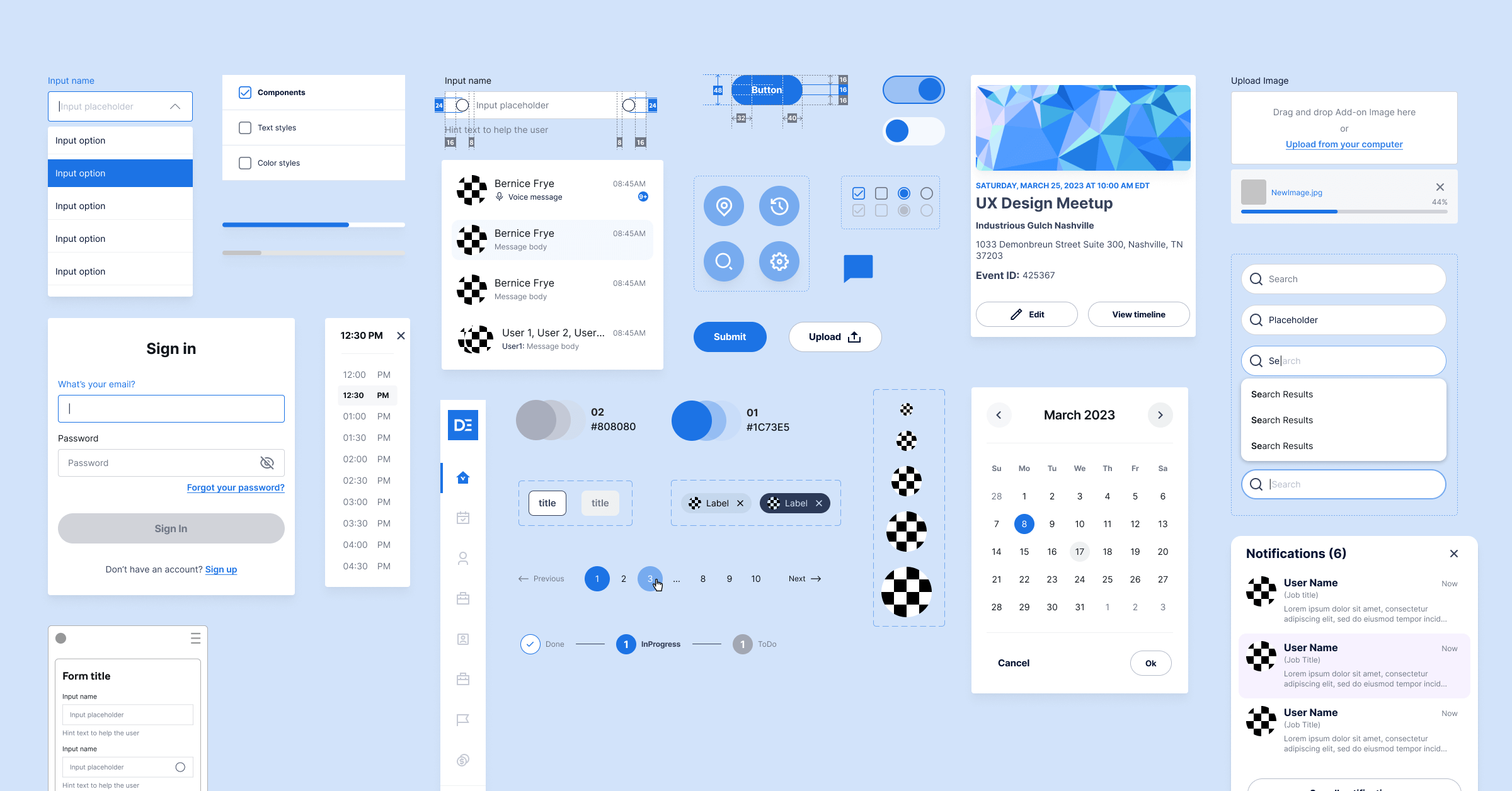
Here is a completed example style guide for your reference
In HTML, the structural language of the web, different heading levels are expressed as <h1>, <h2>, <h3>, etc.
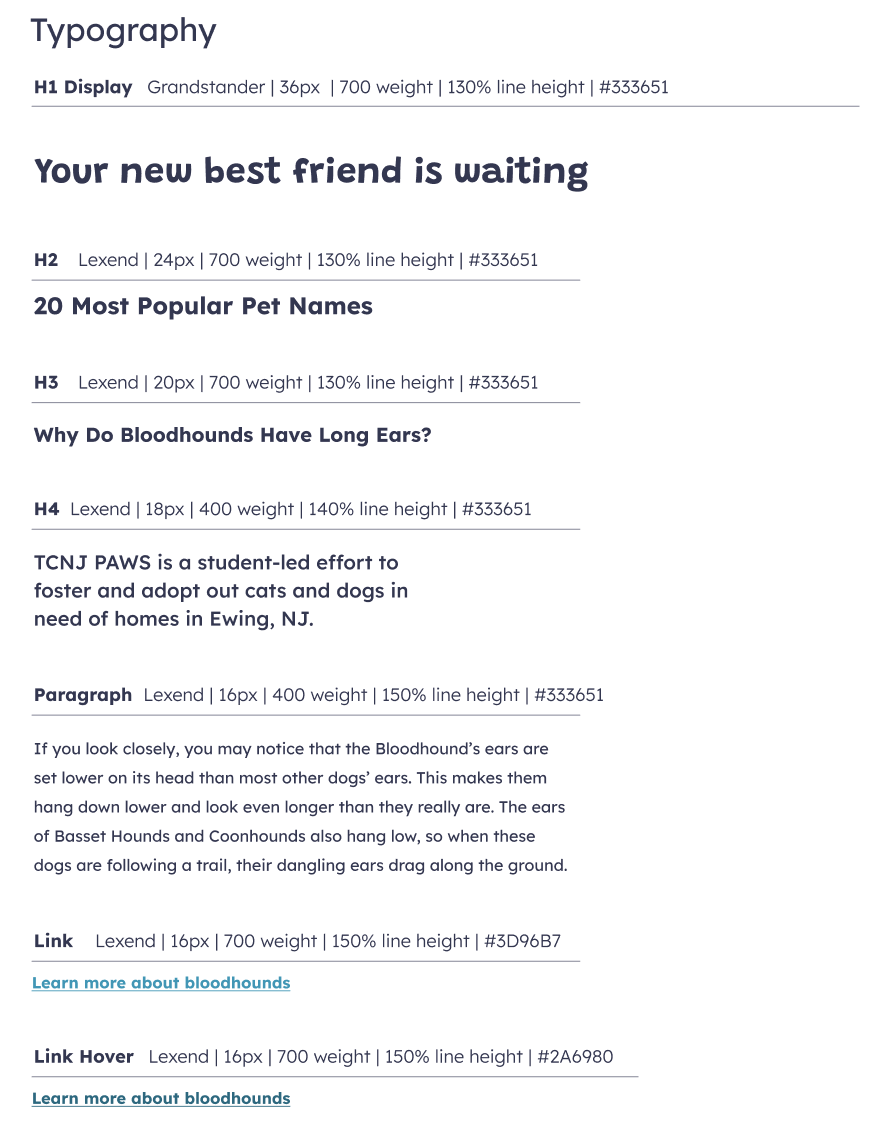
In total there are 6 possible heading levels, h1-h6, but in practice few websites use all 6 levels, so I have included h1-h4 in the style guide for simplicity.
In general, H1 usually looks the biggest visually and is used as the title for the page. There should only ever be one h1 per page. Conventionally the headings get smaller in size after h1, though they don't have to. You could differentiate and h3 from an h4 with a different font weight or underline if you wanted to.
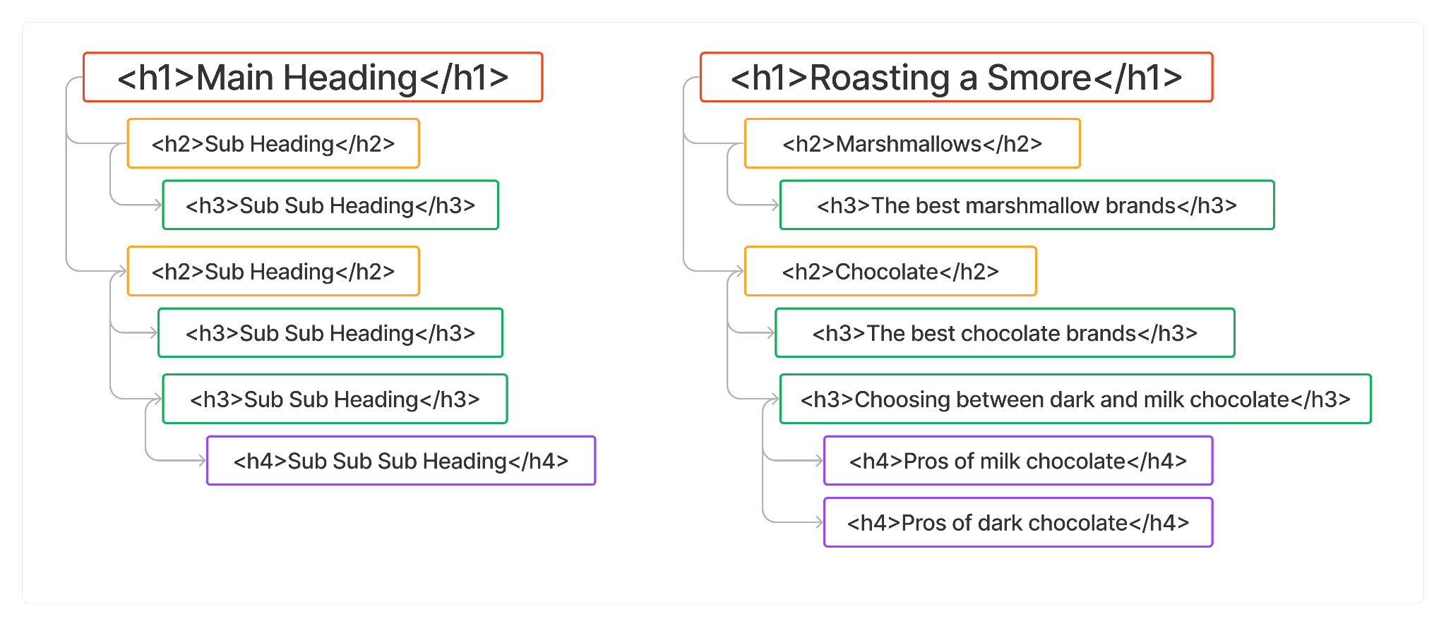
An important concept to understand with headings that is not always easy to grasp is that and h2 is a subheading of an h1, and an h3 is a subheading of an h2. You would only use an h3 as a subheading for a section under an h3. For example, on this page, "Creating a Style Guide" is the one and only h1 for the page. It describes the title and main content of the page. "Style guide template" is an h2 and "Style guide template sections" is an h3 because it is a subsection of "Style Guide Template". If the next heading moved on to a different topic unrelated to the first h2, it would also be an h2. "Typography" is a subsection of "Style guide template sections" so it is an h4. "Colors" below is a subsection of "Style guide template sections" as well. It should also be an h4.
For each of the type styles listed, you want to define the font name, font size, font weight, line height, and hex code for color. It can be helpful to experiment with these factors in a layout before making any decisions, which is why the example has a blog layout to the right. A general rule of thumb is to avoid too many variations in fonts or colors. If you want to add additional styles for more type styles, such as more headings or functional text, this is fine. Refer to the slides from Class 2 for more information on how to choose the values for these styles.
Below each type style, show an example of the the typography in use with all of the values applied.
For examples that change when interacted with, such as links or buttons when a mouse is hovered on them, or if a button can be disabled, it's important to show all of the possible states.
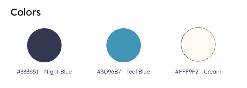
This section is for the primary colors you will use on your site. You can add more than three if you want! Consider the 60/30/10 rule - use your primary color 60% of the time, your secondary 30% of the time and any tertiaries 10% of the time. Of course this just a guideline, not a rule. Using too many colors can make a website look messy. Instead consider different shades and opacities of your primary colors.
Give each color a memorable name along with its hex code. Hex codes start with the # symbol and then are followed by 6 digits. The first two digits represent the "red" value followed by the next pair representing "green" and the last representing "blue". Each two digit has a scale of 16: 0-9 followed by A-F. There are 256 possible combos for each of the RGB components, giving us 16,777,216 different possible digital colors!
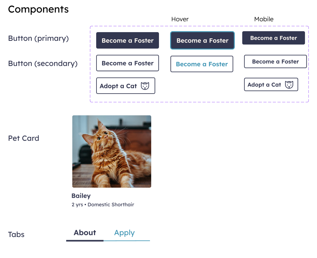
Components are the most open ended piece of the style guide. Components should represent elements of your design that get used over and over again. Usually they consist of several smaller elements that are always used together in a certain way. In large web projects, designers might have an entire "component library" of all the components that they use throughout the design. The benefit of this is that whenever a designer needs to reference a component they can find it quickly and use what they have already built rather designing it again from scratch.
Common components include button styles, "cards" of information (which usually consist of an image and text that link to another page), testimonials, accordions, stats, etc.
For your style guide, add any commonly used components.
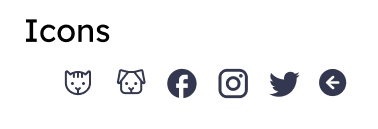
Icons are another factor that can make or break a website's professionalism. When used well, icons can elevate a brand, giving it a unique style. But icons can look bad if they are inconsistent. Icons should have the same line weight and general style to feel cohesive.
It's also important to remember that it is not accessible to use an icon without a label, unless the icon is universally understood. For example, a magnifying glass has at this point is pretty well known to be a search icon. More abstract icons should always have a label associated with them if clicking on them is an action a user can take. It's a good practice to label even more common icons like search or the "hamburger menu" icon
Add the icons you use (if any) throughout your website for easy reference in your style guide. A good place to find premade icons you can download and add to your project is a site like SVGRepo
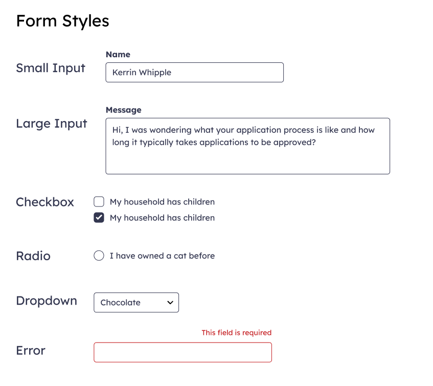
Lastly, form styles. It is likely that your website will in some way use forms, whether it's for a sending a contact request, a search bar, a sign up form, etc. For this reason it is good to define your form styles, especially since the out-of-the-box styles provided by HTML are rather...ugly. With form styles, pay attention to aspects such as border color of inputs, the font used both for labels as well as the input text, and elements like checkboxes and dropdowns.